Introduction
The genesis of this new typeface, Gonia, started with my interest in the serif shape and how they change the overall impression of a typeface. The influence of these seemingly small details can be found in the range of approaches that have come to define the main typographic styles, from elzévirs to the modern slab serifs. Though there remains some debate as to their origins, the serif terminal has become a common sight in type design and serve to sit the letter forms on their baseline and help the eye along a string of text.
I have held a special fascination with the slab serif shape, sometimes named Egyptian, that is defined by the heavy, rectangular forms employed. Introduced in the late 19th century, these bold forms answered a growing demand for so-called display typefaces that could be employed in large sizes on posters and other exterior setting. With the advancing industrial revolution and the rise of poster printing as a medium of communication, people were searching for ways to attract new customers to their new industries. Yet since this demand was quite new, most printers simply enlarged the smaller, text intended typefaces, that while functional, did not seem suited to the task.
This period of typographic exploration led to the rise of two new styles, the sans serifs that completely removed the serif from the letters in an effort to simplify the shapes and maximise their space usage. The second style is the slab serif genre, that this time, put more emphasis on the serifs by making their weight much more imposing and bold. While the sans serif style has gone on to become one of the more popular styles in contemporary communication, the slab serif has lived on the sidelines, sometimes employed for titling but otherwise less well known than the other typographic styles.
The slab serif style, sometimes also referred to as the Egyptian style, was very popular with woodcut printers and hence gained some recognition as the default western style in American folklore. The name Egyptian also created some confusion about the origins of the style, but one must remember that this was also an age of rediscovery of ancient Egypt. This led to this new and surprising style being label Egyptian, simply as a way of classifying the typeface as something exotic or foreign. With its heavy serifs and bold forms, it led to a striking and appealing new style for posters and other print items.
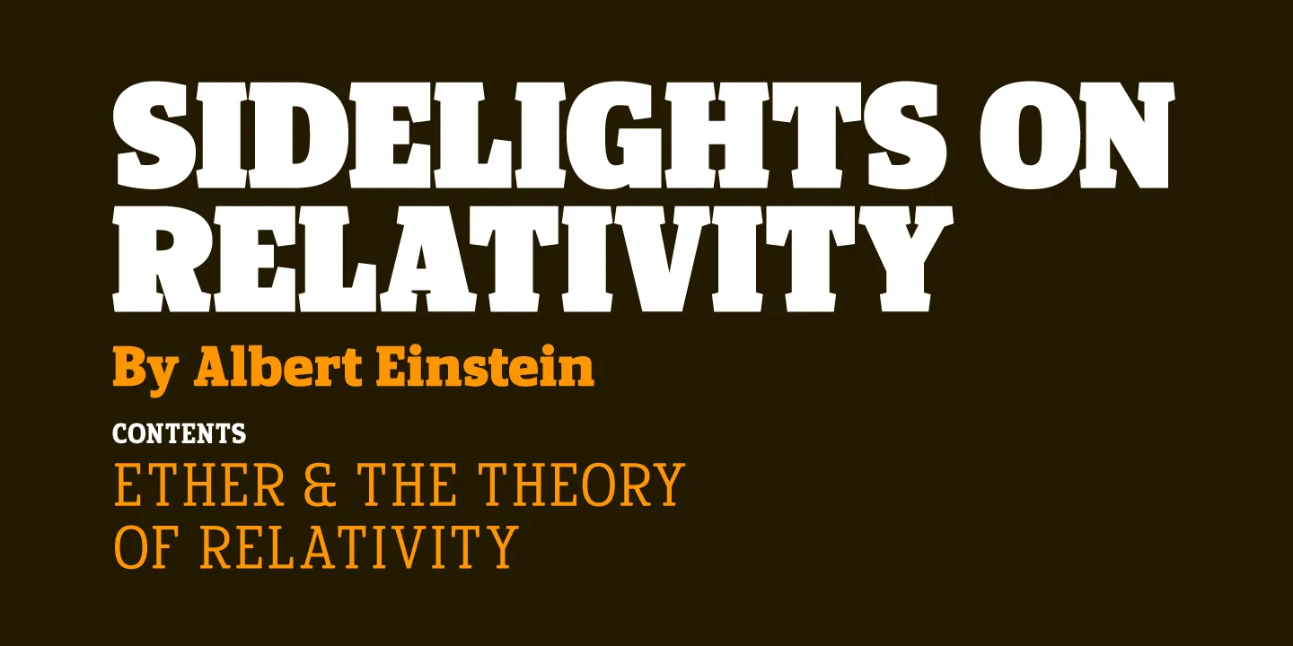
As I started the project, I therefore had a wireframe of the general direction I wanted the typeface to explore. I also had a clear goal, I wanted a complete typeface that could be employed for titling, as the origins of the style dictated, but that would equally function well for longer passages of text, I therefore wanted a versatile, multiple weight, slab serif family.
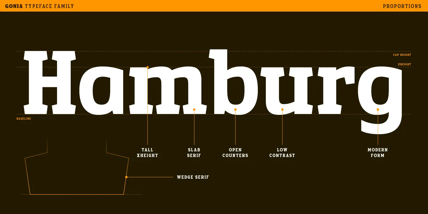
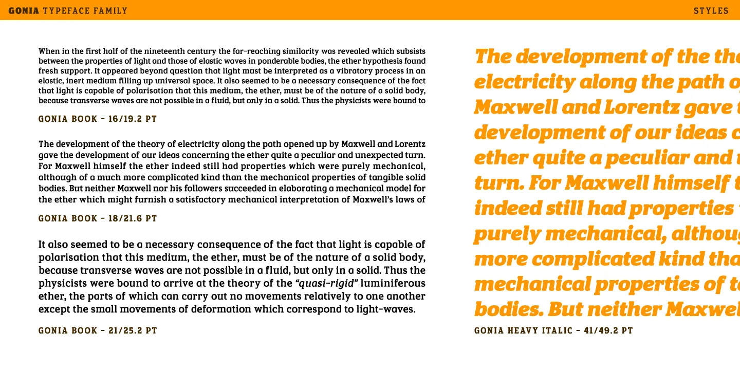
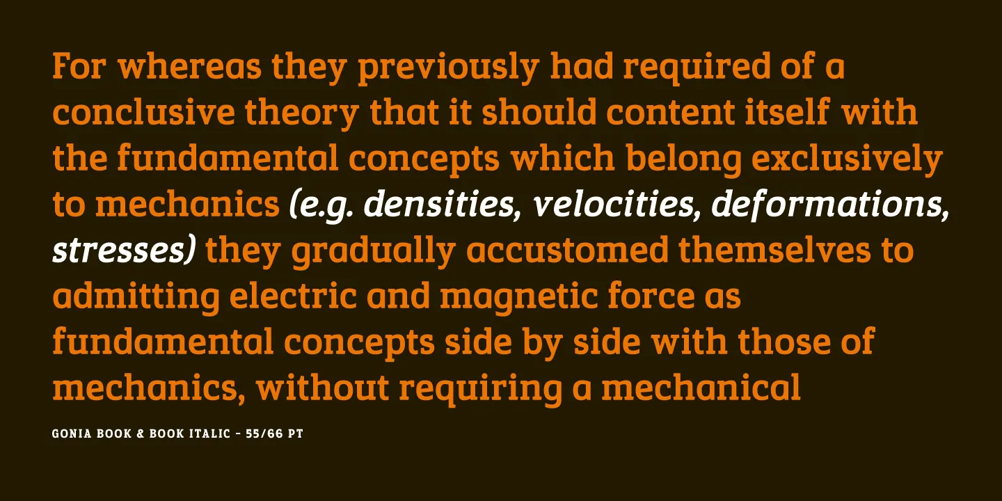
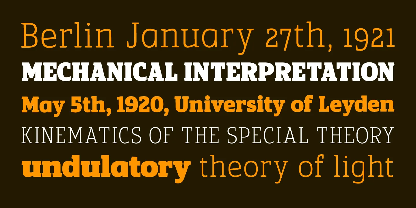
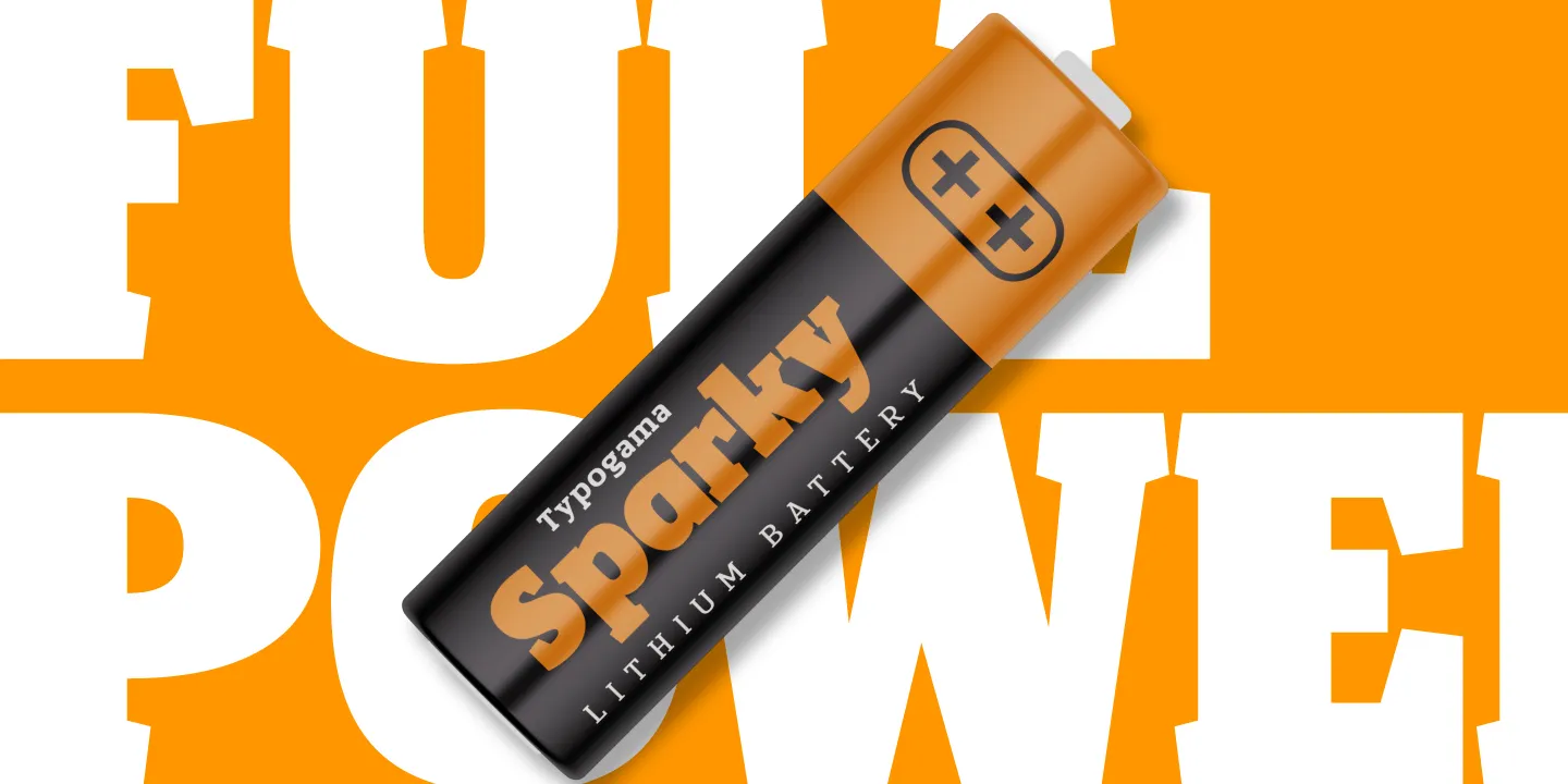
The main design feature is actually found in my approach to the serifs, rather than working with a rectangular block, the serifs employ a wedge shape, with very slight diagonals on the sides and a pointed central axis. These small, seemingly unimportant details are what created the main dynamic in the typeface. These changes had the affect of lightening the overall serif and produced an interesting change related to size. In small point sizes, the serifs seems regular, rectangular and classic, allowing a fluid and seamless reading experience. But as the typeface is increased in size, the finer details become more prominent, highlighting these particular, unique traits that give the typeface so much personality. This double lecture of the form was of particular interest to me since it highlighted two aspects that I wanted the typeface to embody, functioning as a legible text typeface in small sizes, while also containing enough finer details to make the typeface impactful and interesting in large point sizes.
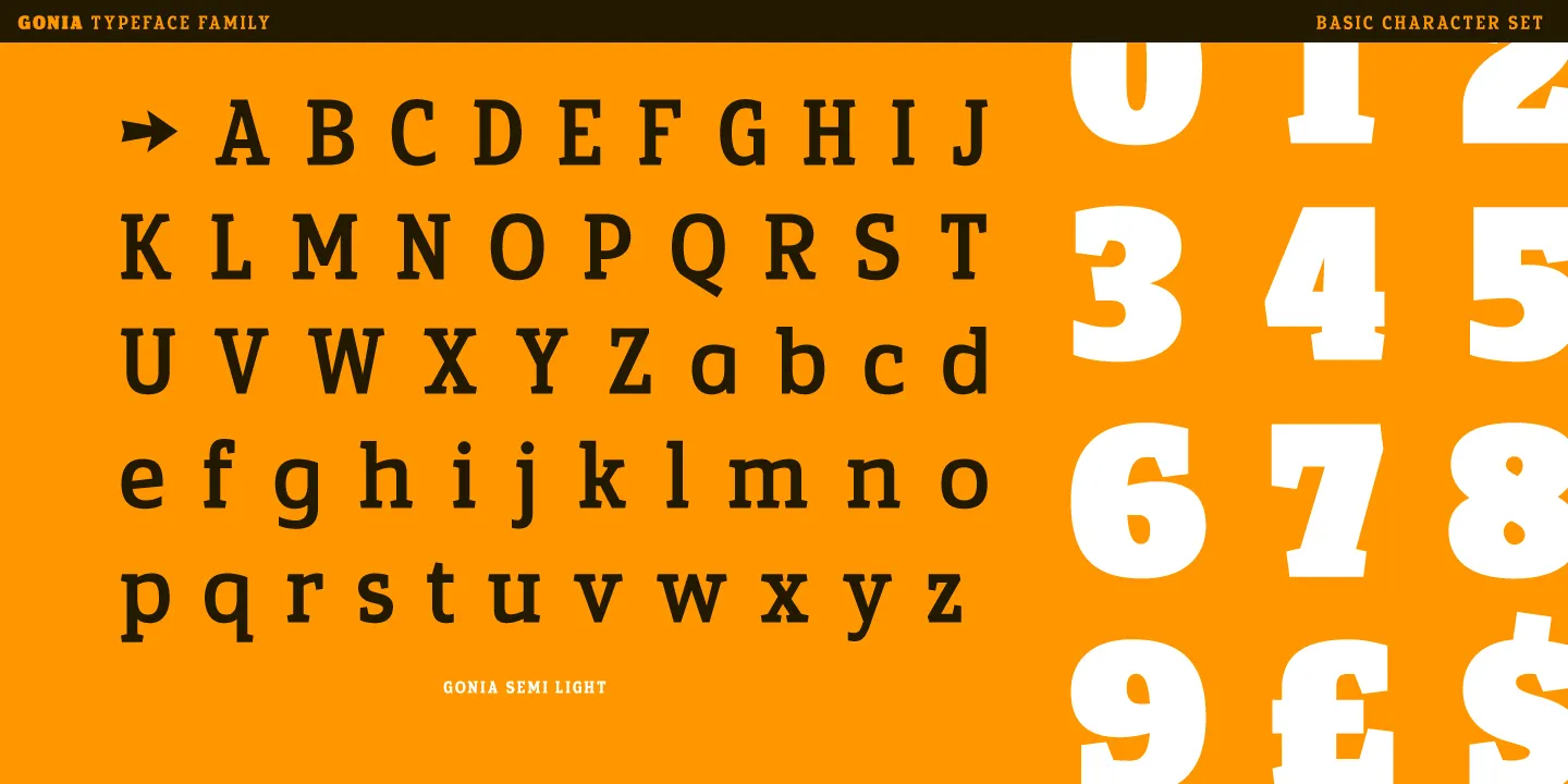
For the actual letter construction, I wanted to approach the design with a rational process, embracing the modern principles, therefore focusing on a clear, solid form with a bold appearance and strong balance. I also intended the typeface to be economical in terms of type setting, so I aimed to design a narrow form that seemed like a perfect compromise. In that same thinking, I used a relatively tall x height with short ascenders and descenders, further compacting the letters, but always with a keen eye on keeping the shapes open and clear so that they would remain legible in smaller point sizes. That desire, for clear shapes is what also led my decision concerning two principle lowercase letters, the a and g. The historical and reputedly more legible form, is the double storied shapes, but with their multiple horizontal strokes, these forms can sometimes appear very dark. I therefore stayed on my modern line of thinking, and opted to use the simplified, single bowl open shapes for both letters. Their forms maybe slightly less adapted for running text, but they provided an open, balanced form that best suited the surrounding lowercase forms.
Family choices
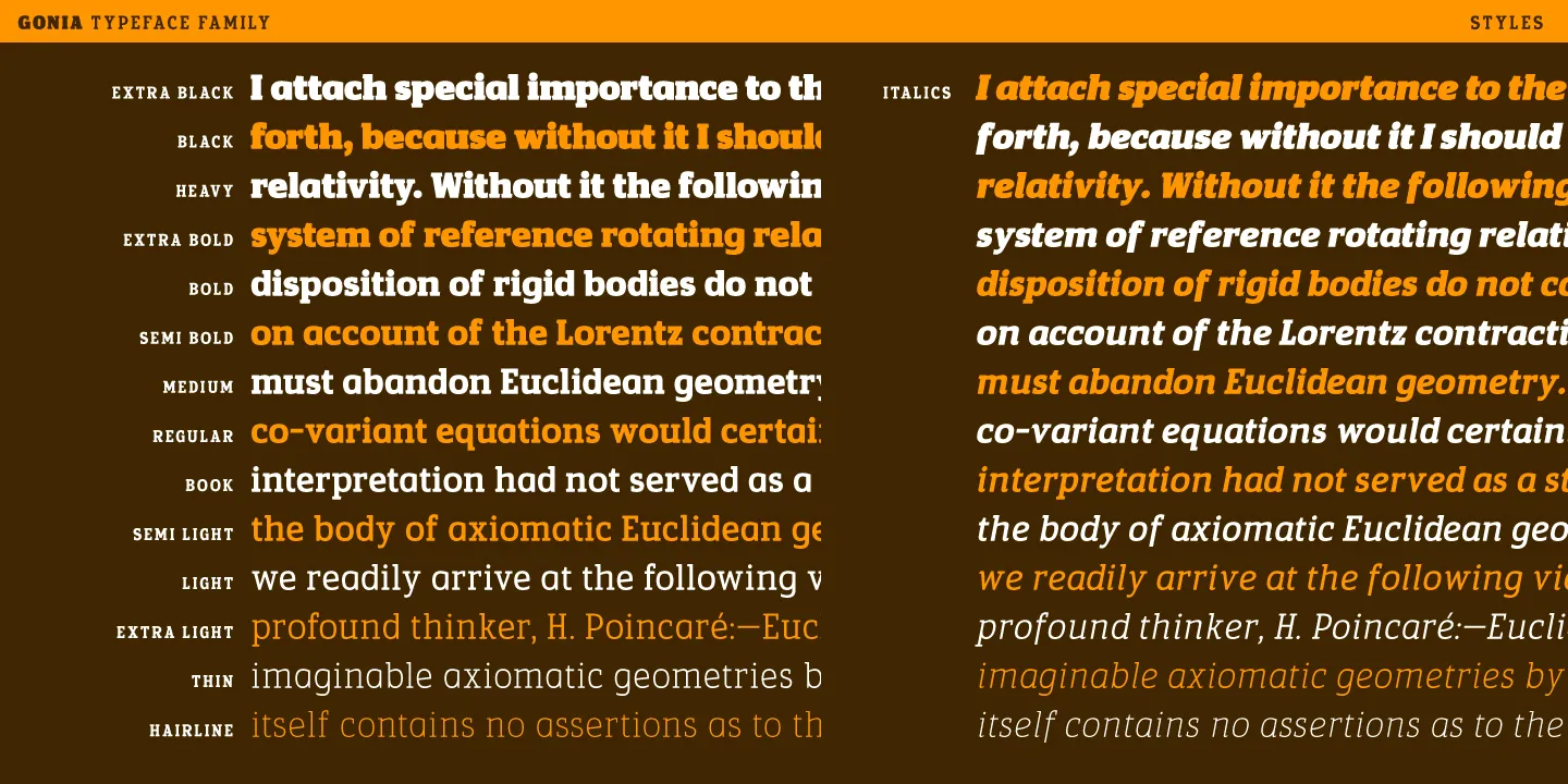
While many Slab serif typefaces were created as single, stand alone fonts destined only for use in attention grabbing headlines, I was clear from the outset that I wanted to expand my design to cover a range of different weights. I was confident that a well balanced letter in the slab style, could offer an intriguing and interesting solution in a range of settings, so including a variety of weights seemed like a logical direction.
My initial work focused on the intermediate weight, that would become my Regular style. This average weight allowed me to construct the base forms while starting to explore how I could compensate and best balance the more extreme Black weight that I would then work on. After these first two styles, I then decided to go to the extreme opposite by crafting a very fine and delicate weight that would become my Hairline style. While these thin weights have gained traction and recognition in most sans serif forms, it seemed more unique and original to equally explore this range for my slab family. While the overall construction retains much of the DNA of the original weights, the overall stroke is less contrasted and the serifs are slightly longer to better balance the white space in and around the letters.
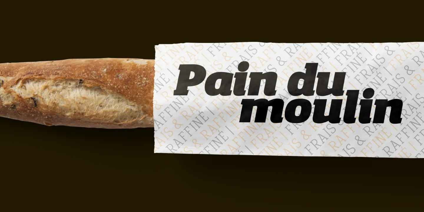
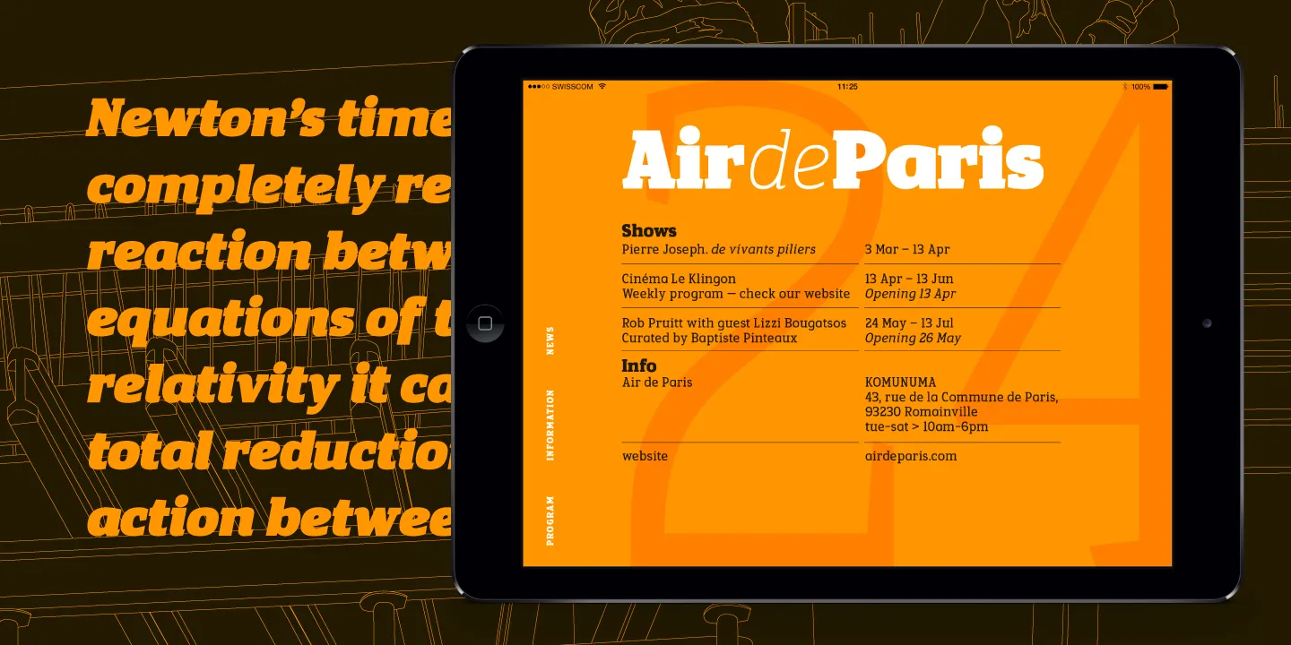
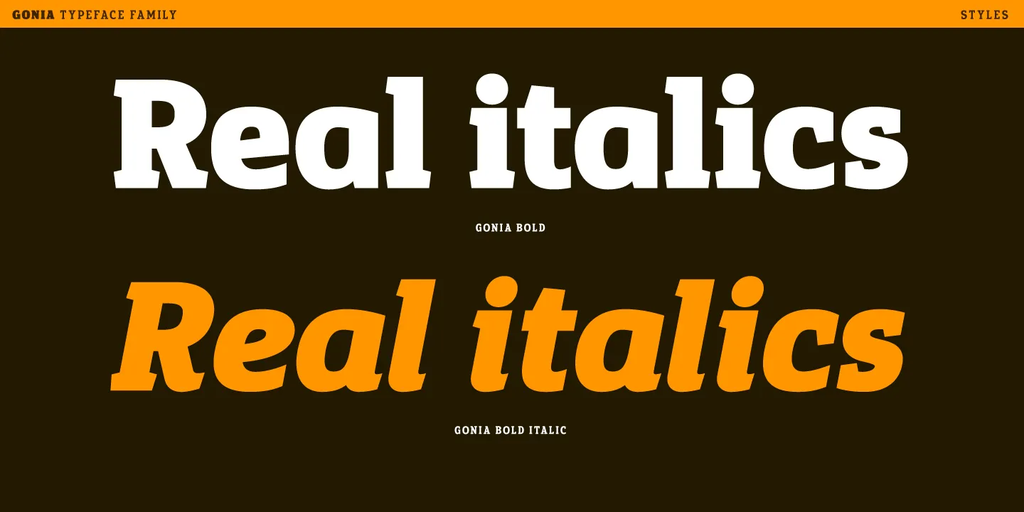
While I was conceiving the typeface, I had initially planned to only work on the roman forms, avoiding any italic weights. But as a worked through the styles and the first samples, I quickly revised my position since omitting the italics seemed to reduce the layout possibilities and style variations that my full family intended to offer. The quickest and easiest solution was simply to slant my roman forms, creating the so called Oblique style, but this seemed to rigid. I knew that a good italic must offer a clear visual distinction between the two main styles. I therefore went back to the drawing board and started to explore a more calligraphic and manual influence to the letters. This approach is particularly visible on letters like the i, l or n, where the main stem features a small curve at the bottom of the stroke, gently pulling the eye from one letter to the other. The true italics are therefore mainly distinguished in the lowercase forms. Overall, the italics are slightly lighter and more condensed than the roman styles.
As I neared the end of the project, I started to turn my attention to the fun aspect of the process, the font naming. I had originally looked for inspiration in the historical styles and designers, but I felt that my approach had been principally been driven by my own exploration so a historical link seemed false. My process had been dominated by an exploration into the angular aspects and small variations these angles could bring to the design, hence angles, seemed to be the dominating factor. I decided to take inspiration from the ancient greek work γονία, pronounced Gonia, which translates to angle or corner for a short, original and striking name.
Opentype
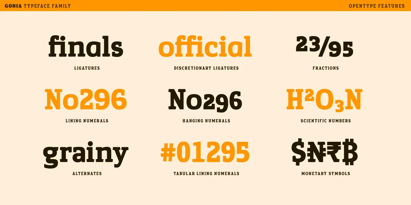
As with most of my designs, Gonia includes a range of Opentype features to be able to offer the best solution of each setting.
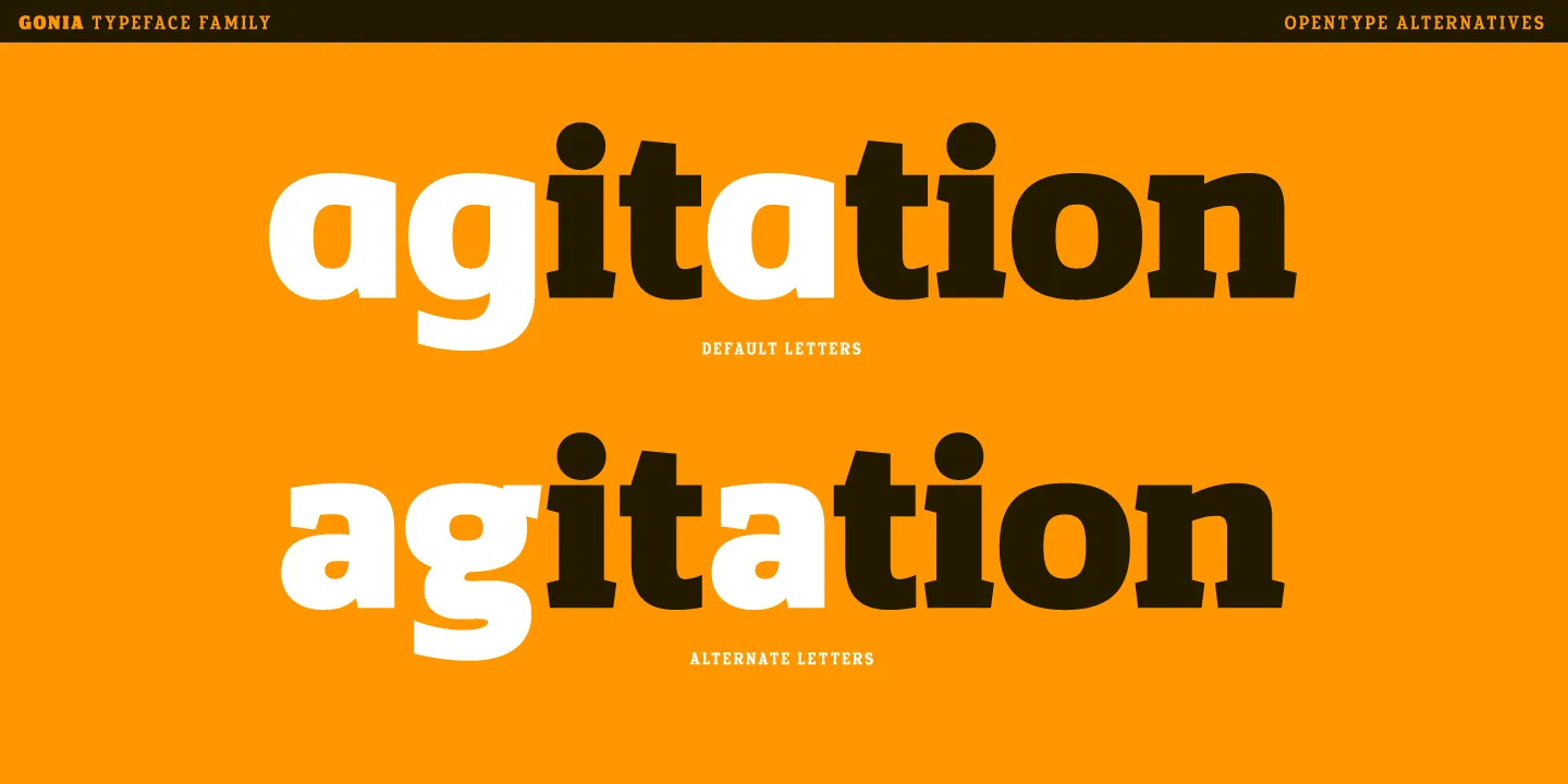
The first focus was on including some alternate letters to fully answer the question I had raised with my choice of single storied lowercase letters. Through automatic substitutions in the Opentype technology, this allowed me to equally include the historical double storied forms for those that would prefer this form. Since the debate can be seen as subjective, this solution offered the best of both worlds, my choice is the default style, but any user can easily switch to the classical forms.
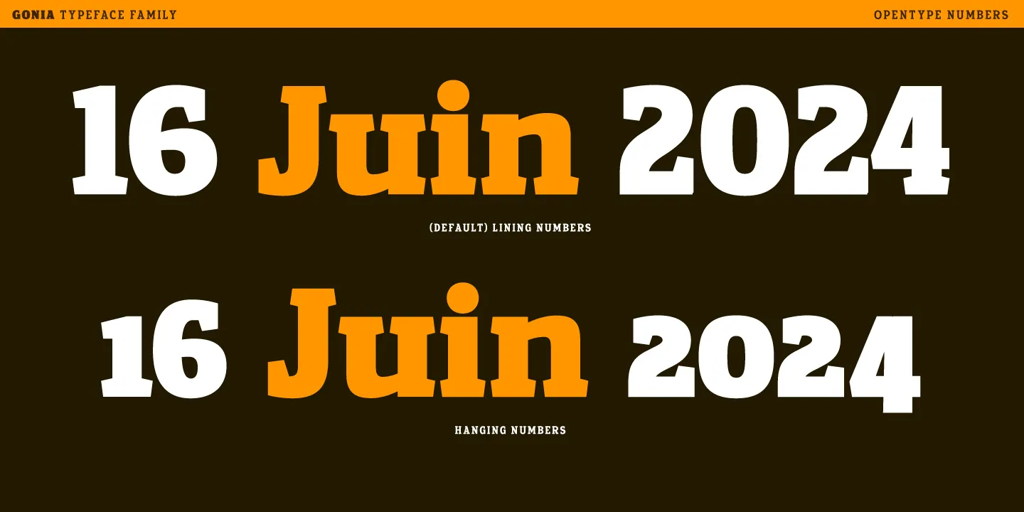
For the numerals, I also employed the opentype substitutions to allow a selection of number styles that can best suit each situation. The default set, the lining numbers, are figures that are aligned to the capital height and are best suited for titling or uses were the alignment with the uppercase forms is essential. The second set, the hanging, or old style numbers are principally aligned to the lowercase but feature ascending and descending strokes that mimic the rhythm found in the lowercase letters. These are best suited for use in running text were their smaller size will better match the overall texture. A third set, named tabular lining, are numbers that are equally aligned to the capitals but share a common width. The purpose of these digits is to allow the setting of different numbers while remaining aligned vertically, typically used in tables and columns. A final set of figures are the scientific numbers, these are employed for the setting of inferior or superior values used in scientific formulas. These smaller figures are equally employed for the fraction feature. This opentype features allows the setting of any type of fraction, simply by separating the values using the slash bar.
Uses
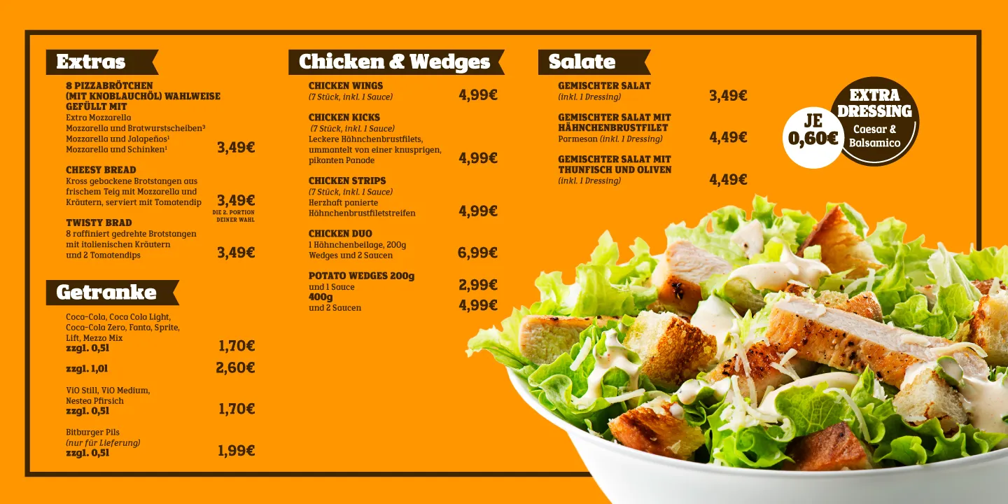
Despite its inspiration in display styles, the Gonia typeface has expanded its style across a wide range of 28 styles and has become a truly versatile family. A quick glance may reveal a classical style, but upon further inspection, the finer details of the typeface conjure a unique and distinctive vision. Through this extensive selection of weights and italics, Gonia offers a pleasant reading experience in small sizes with a solid presence and balanced weight. Its true character comes to light in larger point sizes where the subtle serif variations offer the text a vibrant, dynamic style that can grab attention while staying economical in space usage.
Developed as a multilingual family, it supports 89 Latin based languages through a large character set that includes all the necessary punctuation, accents and symbols. Thanks to the Opentype features, users can further enhance the content through a precise selection of the correct letter forms or numerals to suit their needs.
Available as stand alone static styles, Gonia is also available as a single variable font, offering the users even more control over the weight variations. It is also available as a web font or any other digital format, including apps and e publishing.
