Introduction
The story of the Rootzin typeface started with my interest in a recent design trend that has swept through typography over the past few years, the so called reverse contrast designs.
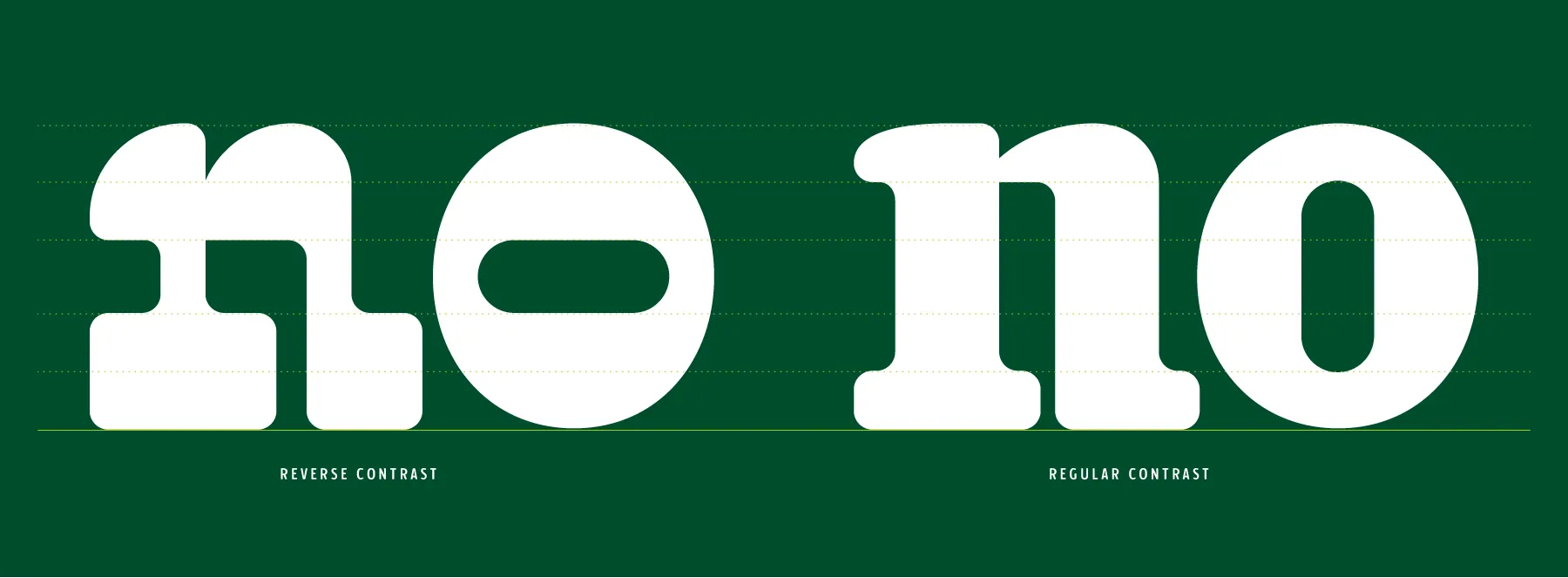
When one talks about contrast in the field of typography, we are referring to the weight balance between the think and thin parts of a letter. This contrast is no accident, and is the result of both of a natural influence and also a scientific aspect linked to how we perceive weights. When the first letters were conceived as movable type, the punch cutters turned for inspiration to the scribes and their manual letter forms. These scribes were employing a wide nib brush, and so, through the act of twirling the pen in their hands as they drew the letters, the descending strokes were heavy and bold while the horizontal strokes were lighter due to the thinner part of the pen touching the surface. This balance of thick and thin is still visible in most contemporary typefaces. But what science later confirmed, was that this distribution of weight actually suits the manner in which the human eye perceives weight. For reasons not fully understood, humans perceive the weight of a shape differently in horizontal or vertical proportions. If the same weight is shown vertically or horizontally, the horizontal weight will be perceived as being heavier. So, probably without their knowledge or understanding, the scribes had actually implemented a solution that was perfect for the way humans perceive mass.
This solution for the distribution of weights remained, and remains the standard within the world of typography, but the Industrial Revolution also inspired a new approach. With the rise of commerce and especially, accessible and cheap printing, printers were looking for ways of grabbing attention and making their headlines stand out against the growing sea of posters that were splattered across the cities. They had initially turned to the most obvious solution, increasing the size of the typography they were employing for books and editions. While this solution worked, the vertical proportions of most posters meant the size increases were always constrained and lacked a real punch in impact. They gradually started to explore the idea of condensing the horizontal widths to allow a maximum usage of the space, and this lead to the rise of a series of interesting explorations. Of these explorations, two particular styles grew in popularity, the sans serifs, that removed the serifs so as best to maximise the space, and the reverse contrasts that have piqued my interest. The idea behind this style was to invert the thick and thin areas of the letters, laying the boldest part on the horizontal strokes, so as to have a bold form while remaining condensed in the horizontal proportions.
The reverse contrast style has therefore been around for over 100 years, and yet, despite certain bouts of popularity, it has always remained on the fringes of what is considered good typography, until, as now, a new generation rediscoverers the style in infused a new value into the explorations. I would include myself in these observations, as I have been aware of the style for some time, but often found myself, probably in a slightly snobbish manner, dismissing the designs as being simply ugly. But these discussions about beauty are, for me, very complicated in the world of typography, does the question of beauty even represent a value that we could mesure? I have often felt that the main driving force behind our perception of typography is familiarity, humans have been reading for as long as history exists, and this familiarity with letter shapes and styles has been passed down, from generation to generation, leading to a certain expectation. One only has to think of how sans serif letters were perceived at their inception, being attributed the title of grotesque letters, since readers found the new forms so particular and unsuited. And yet, some 100 years later, it has become the default style for most contemporary users. This reflection lead me to question my own perception, why did I also consider the reverse contrast ugly? Was I simply repeating the claims that others had given me, or was there some more fundamental issue that I was being influenced by. As with anything in my life, the answer lay in exploration and research, how best to have an opinion about something, try it out! And so started the creation of the new Rootzin typeface.
Dna of typeface
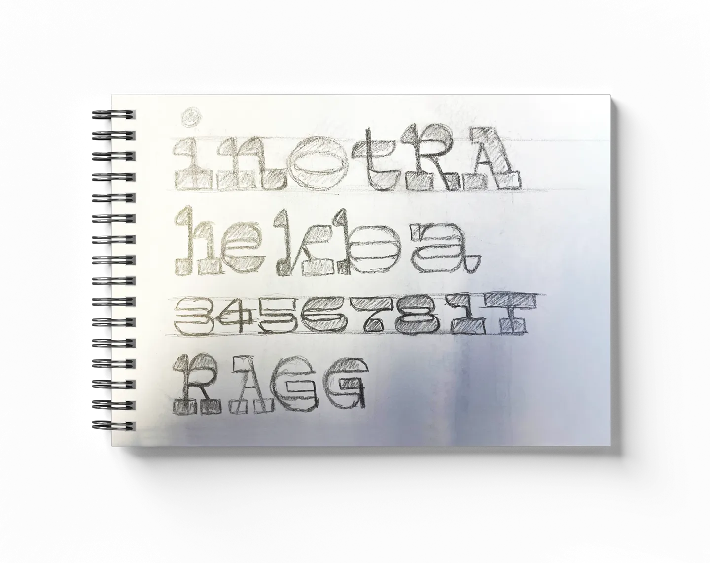
I therefore embarked on this new typeface with a very clear idea of my general direction in relation to the overall style, but I wanted to add a few additional touches that I had uncovered during my research. I decided to work on a modular approach, though this time, dividing the heaviest weight along the vertical axis to create a very dark and eye catching design since my intended use was headlines. With this dark stroke, I then decided to work with a very pronounced contrast on the finer strokes, creating an interesting flicker between the positive and negative masses. I also decided that I wanted the design to remain soft and friendly, despite its very dominating form and so opted for a rounded approach on the strokes and terminals. This approach seemed to best match the overall proportions of the letters and also added extra separation between each letter, which would be important as I intended to have a narrow letter spacing. And finally, the use of the slab serif terminals to best balance the overall form, this seemed even more important since the main stems had become very light. The rounded slab also lent the design a very solid base, anchoring the letters on the baseline and pulling the eye across the forms.
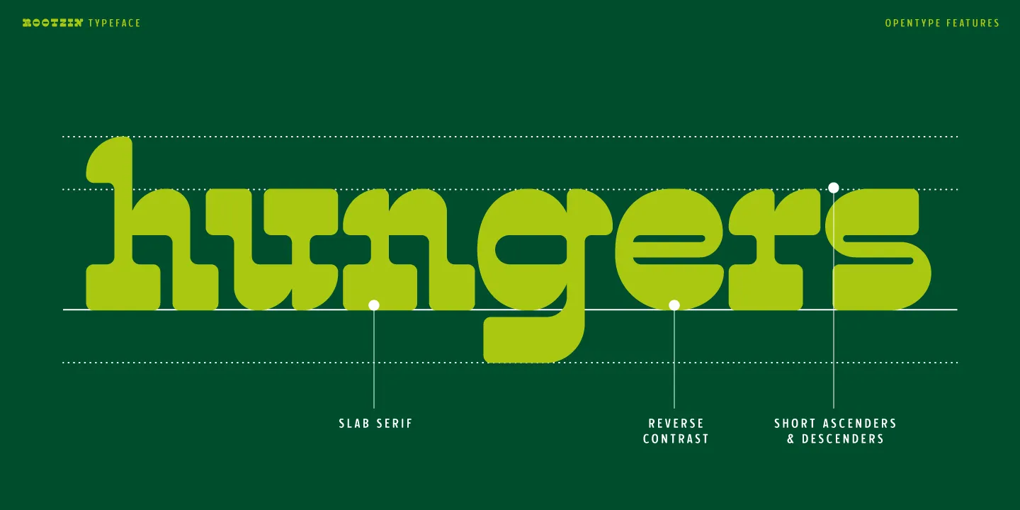
This modular approach, therefore, led me to start by defining the overall proportions, a relatively wide form with the main weight in the horizontal stroke. The first balance was ensuring, with this very heavy weight, that the lowercase letters still remained open. This was especially important with the more complex letters like the a or e that contained multiple strokes in a small area. I also had a few trials on the best solutions for the diagonals, either using a thin stroke or adding in some more traditional weight distribution, and for the sake of legibility, I finally decided to keep a certain weight on the diagonals since they transmitted the main element of the letters.
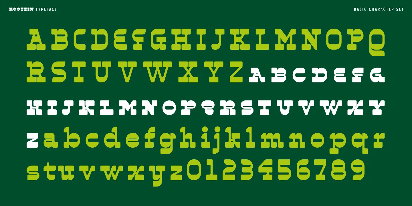
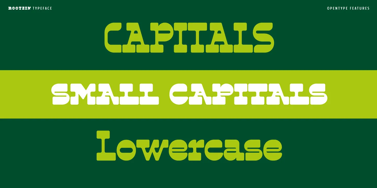
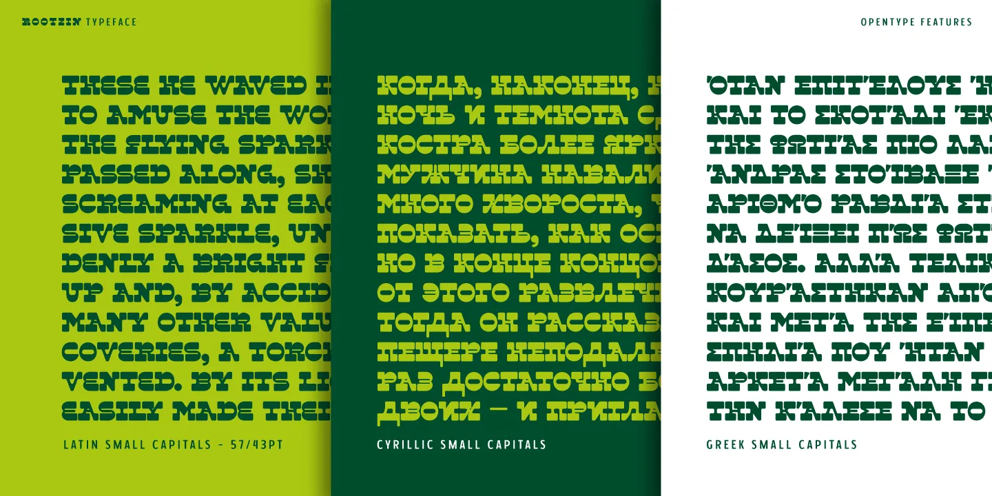
With the balance issues being more prevalent in these smaller sizes, I had initially only focused on the lowercase forms and came across a slight dilemma as I started work on the capitals. Through common typographic standards, the capital letters are larger than their minuscule counterparts to create a visual cue that help reading, yet in my case, my modular approach was less adapted to this taller proportion. I questioned what was the best solution to choose and finally settled on a compromise that seemed ideal, create and employ the traditionally taller capitals as my default style, but equally include some smaller capitals that were aligned with the original philosophy, as a secondary solution. This decision therefore led to the creation of three styles of letters, the capitals, lowercase and the additional small capitals, that can all be mixed and matched during a layout exercise.
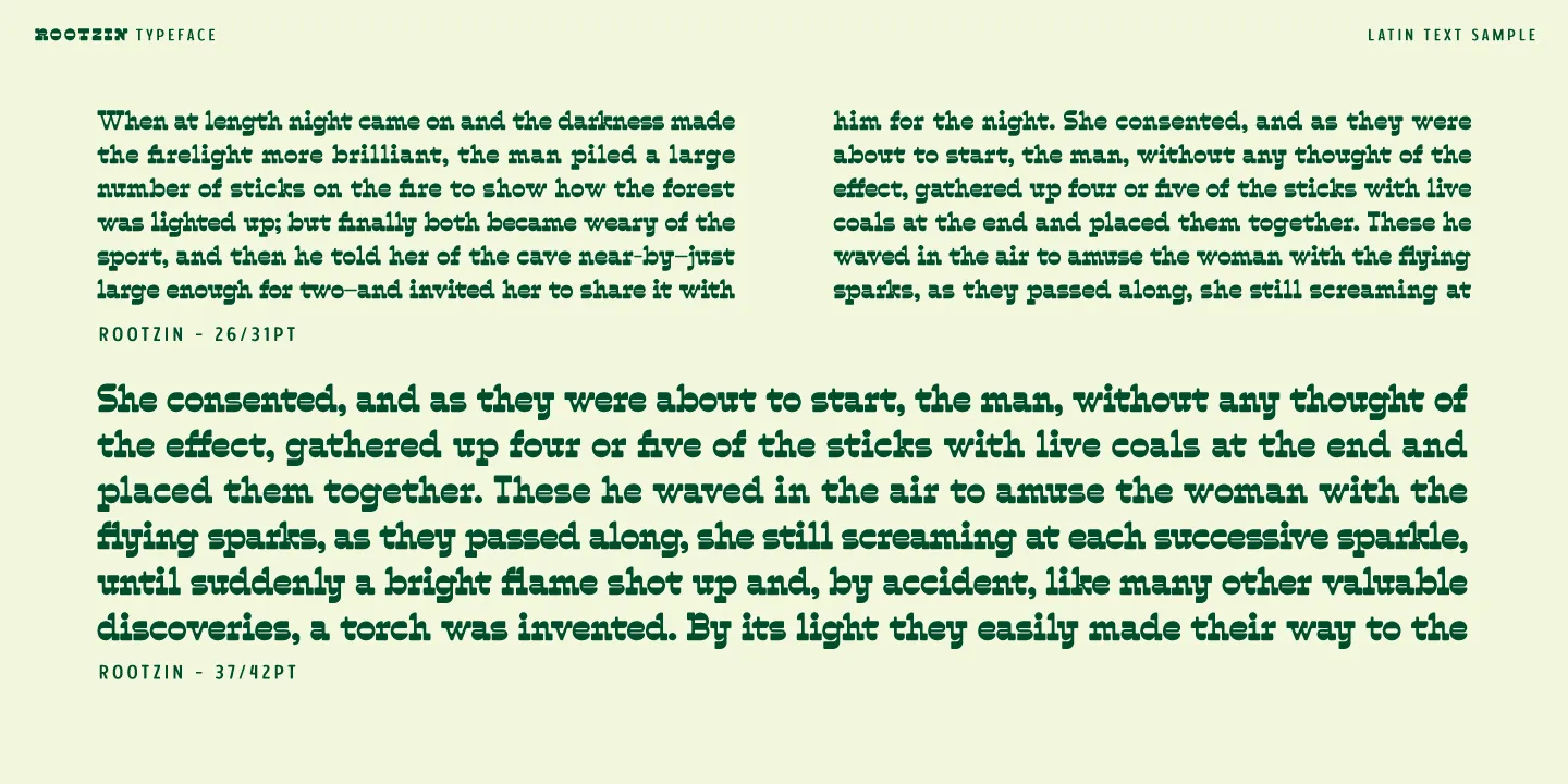
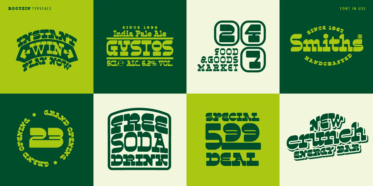
After completing this initial creative phase, I set about creating some first applications with the typeface to see how it would function in real situations, and I was happily surprised. The heavy shapes and serifs created a very dominating letter that seemed playful and fresh. It even worked in some passages of text, but obviously the design was clearly not intended for longer reading.
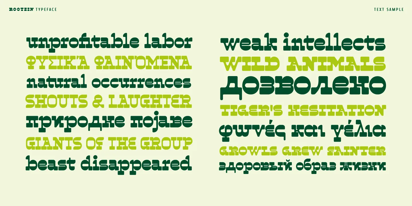
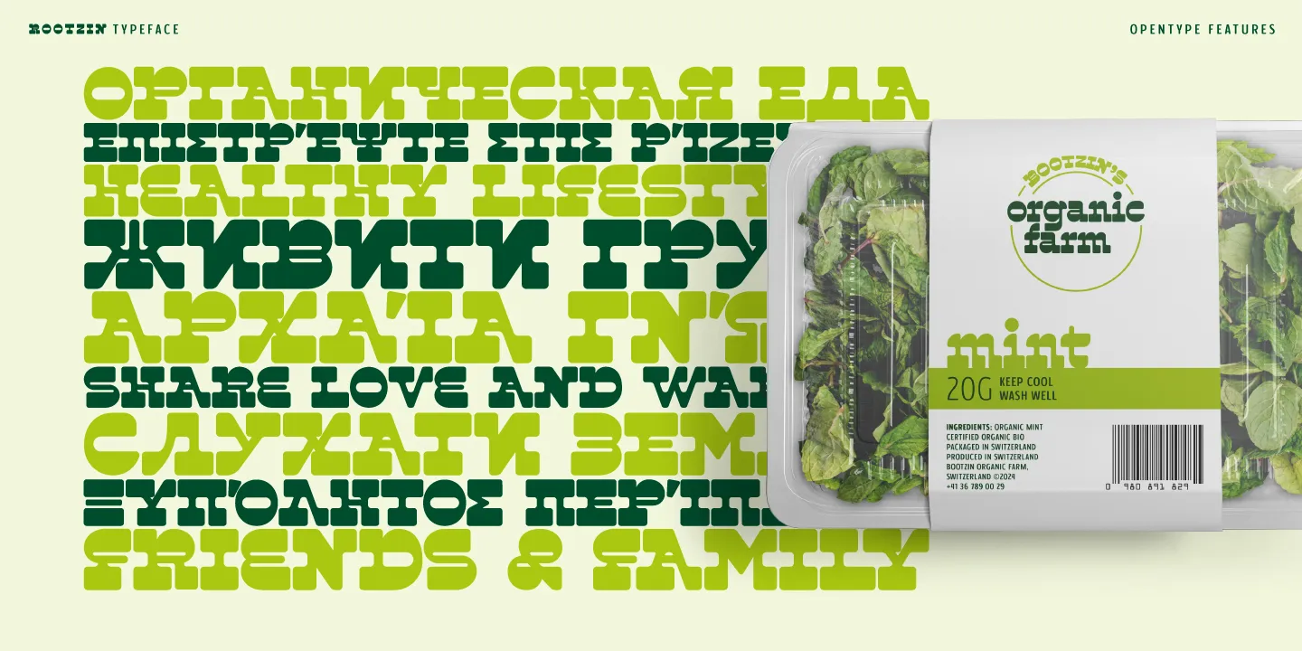
But this also led me to start wondering about all the other possible solutions the design direction offered, it seemed a pity to only design the latin forms. So I quickly decided that the typeface would be expanded both into Cyrillic and greek, offering me a very interesting challenge and process of how this reversed approach could be applied to other forms. The Cyrillic letters seemed nearly organic, probably due to the heavy influence of the capital shapes in this script, and for the greek, conforming its more humanist shapes into the design proved an exciting work.
For the typeface name, I had spent a bit of time playing with different directions, but finally settled on paying a small hommage to one of the original hippies, Robert Bootzin, also known as Gypsy Boots. With its strange shapes and experimental roots, it seemed only fitting to have a name that translated a different vision of the world, so I decided on Rootzin, combining his name and nickname.
Opentype
Despite being a single weight typeface, Rootzin includes a selection of Opentype features to offer even more composition possibilities.
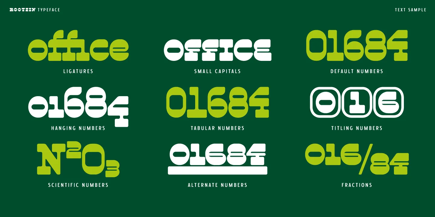
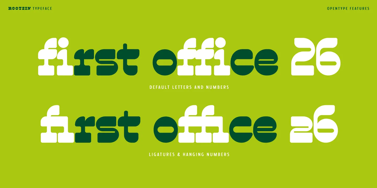
The first range covers a selection of standard ligatures, these aim to correct certain letter overlaps, for example on the fi or ffi sequence. A stylistic alternate feature is then included which features a rounded capital A and two alternative forms for the lowercase a and g that can be easily inserted into any text depending on the users preferences.
As mentioned, when I was designing the typeface, the question of the capital style had been raised in relation to the overall texture of the typeface, with me opting to use the taller forms in the default setting. But thanks to the Small capital feature, the secondary small capitals are also included and can easily substitute either the lowercase or capital letters. These capitals are therefore aligned to the lowercase letters and can be employed as a standalone style, or blended with the lowercase forms to create a uni case sequence. These letters also have adapted punctuation, symbols and numbers to ensure they remain aligned in all situations. Since this typeface includes an expanded character set, it was important to equally incorporate the small capitals in all three scripts, so latin, Cyrillic and greek.
On the number side, Rootzin includes a very large range of different forms to choose from. The default style is the lining numbers. These digits align with the capitals and are used in most titling settings. For the lowercase letters or running text, a second style, the hanging numbers, can be employed. These figures align with the x-height and feature ascenders and descenders like the other lowercase forms. As mentioned, a further set of figures is included when using the small capitals, these numbers all align to the x-height. For design purposes, two further numbers are included, the titling and alternates. The Titling numbers are digits that are enclosed in a rounded cartouche and range from zero to nine and were intended for tables or headlines. For pricing or timetables, the Alternate numbers are small, superior digits that are underlined by a heavy stroke. And the final set of numbers is employed for both the scientific numbers and also for the fraction feature that allows the setting of any range of numbers.
This large palette of features was added as a further enhancement to the typeface and mean that a designer can mix the various forms to achieve a variety of styles, adding extra flair to the layout.
Uses
So following months of work, Rootzin can finally see the light as the result of my exploration into the reverse style designs. Despite being a single weight design, thanks to its three types of letter and wide character set, it can offer a range of solutions for any text or layout. Intended as a display design, it can work as a headline or branding solution, work in either print or digital, and offers a unique and bold voice. My research has allowed me to try my hand at this particular style, and I feel very happy with the resulting typeface that offers a singular vision of typography. My questions about beauty remain, but this process has allowed me to explore a new process and experiment with new ways of looking at typography. The reverse contrast does not help for pure legibility, but for impact and a particular voice, this distribution of weights offers an interesting avenue of exploration that I feel compelled to continue researching.
With over 250 languages covered, Rootzin is available as a postscript Opentype font (off), webfont, app or e-publishing typeface.