Introduction
The basis of the Hektos typeface can be traced to some explorations I had been conducting on new shapes in type design. While the basic principles of typography remain essential for functional typography, display styles that focus principally on headlines and large texts allow a larger scope of exploration and fun!
Ever since my first trial in typography, some twenty years ago, I have been fascinated by the hexagonal shape and its potential in type design. One of my first published fonts, Hexatype actually focused solely on this question. So while the line of exploration was not new, I wanted to see if the shape could be employed in a condensed, heavy typeface in the style of Impact or other similar typefaces.
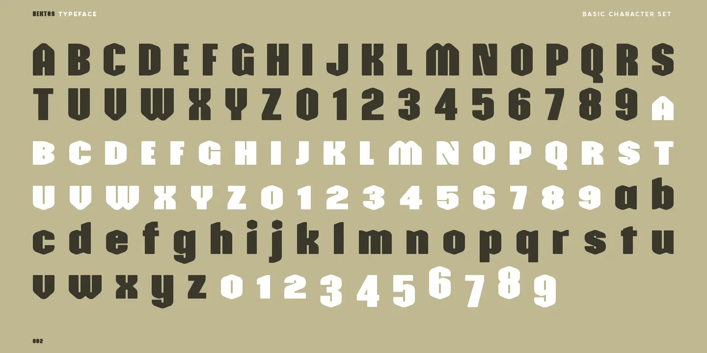
The process therefore started with this loose idea of employing a hexagonal shape in the design process, but after my initial trials, I found the process to be cold and rigid, whilst I had imagined a softer style. So after a few trials, I gradually worked towards a rounded approach on the angles of the shape. This produced a very interesting base round module that would form the basis of the design. An extended hexagonal shape with rounded angles and a very small counter to reflect the heavy, impactful style that was intended. From this first shape that would give me the basic ‘o’, I then turned towards the other letters, starting with the ’n’ and other central shapes. These letters provided the testing ground for the other questions—how the curves would combine with the stems, how to treat the top of the stems, etc.—that would then be uncovered. The main drive was to maintain the very strong vertical tension and irregular diagonal curves that break up the linear mass. An example of this irregularity can be found on the ’n’ where the diagonal terminal is applied both to the stem and equally to the junction to ensure an open and clear form. Thanks to this modularity, the process was quite smooth, and most letters followed along the general principles, but the questions remained about the diagonals for the ‘k’ or ‘v’. Rather than introducing a pronounced diagonal to express the letter, I opted to increase the angle of the diagonals on the various strokes to ensure a clearer, angular shape that would ensure legibility. Despite a visual proximity with the capital ‘U’ both letters remain distinctive in their appearance. A particular mention can be made around the capital ’N’ that is the only form to employ diagonal counters. While the appearance functions, it was the result of a very long process that had initially tried to keep a vertical counter but never quite seemed balanced.
Having worked through the main characters, I started to turn my attention to the overall letter spacing. I had initially wanted to be more extreme, opting for a very narrow spacing that worked very well in large sizes, but that solution seemed a bit too limiting. I therefore finally settled on a tight but still open spacing that would provide the best all-round solution. Designers will play with these settings anyways!
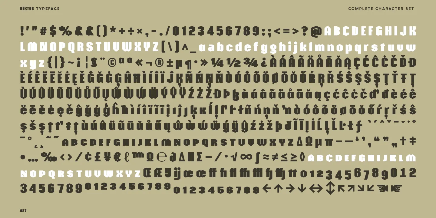
As with most of my typefaces, Hektos includes an extended Latin character set that covers all the punctuation and diacritics required for over 250 different languages that employ the Latin alphabet.
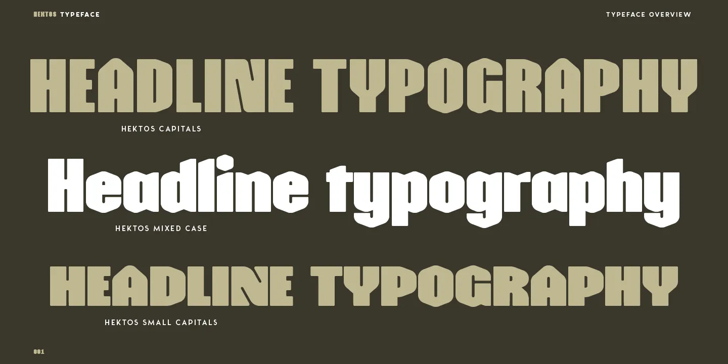
Towards the end of the process, I had started to work on the first test sample, but questions kept lingering about the design since I felt it offered a very interesting terrain. I questioned weights, styles, and even italics, but I decided to stay true to my desire to provide a simple, single-weight design that could serve for headlines. But after a few additional tests, I started to think about additional Opentype features. I figured that I would be employing the basic functions in the numerals and ligatures but also felt that alternates or small capitals could be that last touch, so I decided to include both. The small capitals in particular were deemed of great interest since they could not only offer a further layout choice but also additionally function as a separate set of capitals, more condensed and dark, that could be employed alongside the main uppercase letters.
Font Name
As I had worked on this typeface, I had initially struggled to find a suitable name for the project, with most choices seeming too familiar or generative. So after a long period of research, I decided to turn to foreign languages as a potential source for my ideas and found an interesting answer in the Greek language. Since the typeface was nearly solely focused on a geometric approach and the use of the hexagonal shape, it only seemed natural to search for a name that could reflect that influence. So rather than using the common English words, in Greek, I came across two terms that I could combine into an impactful name. Their word for six is "hex," yet when applied to mean the sixth, as can be found in the New Testament, it becomes "hektos." This name struck me by its simplicity and sonority since the name sounded close to the muscular hero of Greek tales, Heracles, which seemed to evoke the desired strength of the letter forms.
Opentype
So for the Opentype features, as explained, I had initially imagined a simplified approach to ensure the design remained fully accessible. While the additional small capitals do go a bit further, they seem like a valid exception that is generally quite easy to implement in most modern-day software.
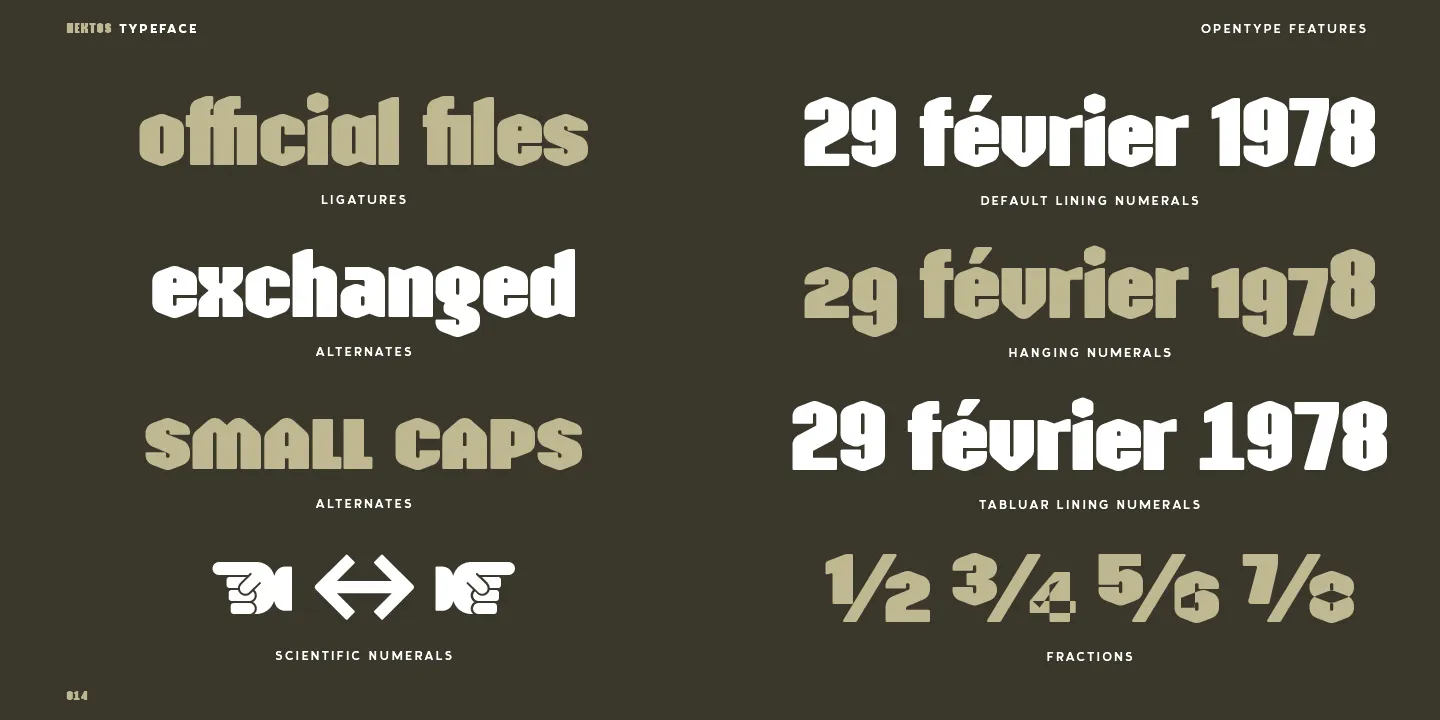
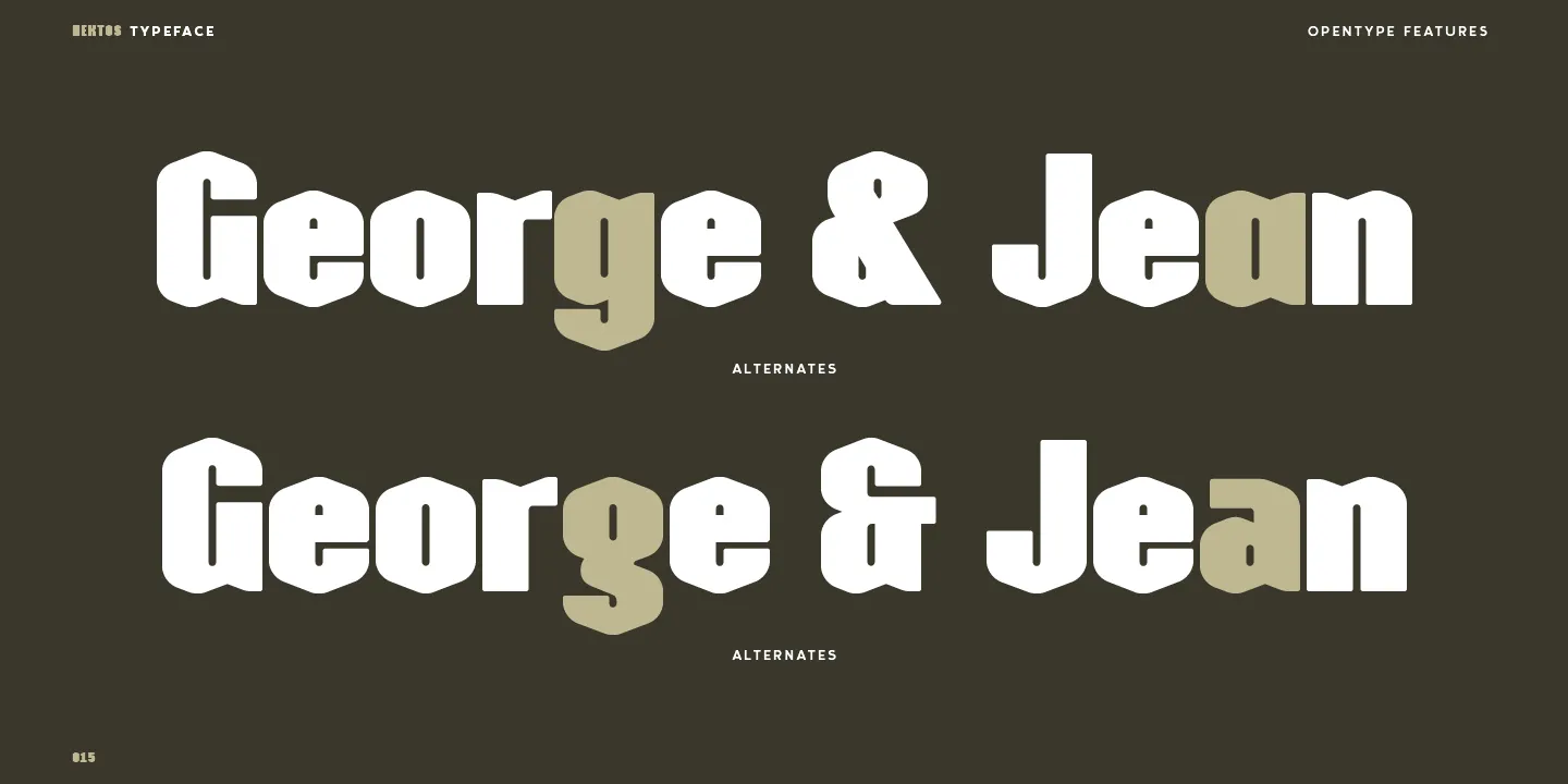
So Hektos starts with a range of ligatures to cover the lowercase ‘f’ and the following tittle of the ‘i’ or ‘j’. The base ligatures equally include the common ae, oe or ij featured in most European typefaces. The typeface features two alternate lowercase letters for the ‘a’ and ‘g’ plus an additional ampersand that employs a historical shape composed of an 'E' and 't.'
As with most of my typefaces, Hektos includes a range of numerals, with the lining numerals employed as the default style since it is the most familiar to users. For lowercase texts, the second hanging numerals can be employed, and these figures align on the x-height with ascenders and descenders that are designed to mimic the lowercase forms. A third set of numerals are the tabular lining numerals, which, like the default forms, equally align to the capitals, but in this case, each figure shares a common width. This common width was conceived to answer the issue of aligning numerals vertically, for example, in the columns of a timetable or menu. The last set of numerals are the small forms that are employed for both the scientific figures and the fraction feature. For the composition of chemical formulas, the scientific numerals can be employed and will set the digits either at the top or bottom of the letters. While for the fractions, these smaller numerals are employed to allow the diagonal setting of any type of fraction, so long as the values are separated by a slash.
Conclusion
Inspired by my interest in the more complex geometric shapes but building on familiar approaches, Hektos was therefore designed as a new solution for impactful headline typefaces. While the overall style, with its strong vertical tension and bold shapes, may seem ordinary, the inclusion of the rounded hexagonal shapes brings a new energy and dynamic to the form. It aims to blend the strength of solid forms with the softness and originality found in its finer details to bring a unique voice to any content.

Designed as a single-weight typeface, Hektos is clearly marked as a display style intended for use in headlines, logos, or other uses that employ typography in larger point sizes. While its distinctive shapes ensure good legibility in longer passages of text, its dark texture is less suited for continuous reading. With a range of Opentype features and a large character set that covers over two hundred different Latin-based languages, it will lend a real personality to any message and will be a solid and stable tool for grabbing attention.